Professional children's book illustration follows established best practices — not because creativity should be constrained, but because these practices solve problems that have derailed thousands of projects before yours. From pre-production planning to final delivery, these guidelines help illustrators produce better work and help authors evaluate the quality of what they're receiving.

Analyze the manuscript thoroughly. Read three times: once for emotional arc, once for visual moments, once for gaps the illustration should fill. Mark page breaks, identify the climax, and note where the page turns create the most narrative impact.
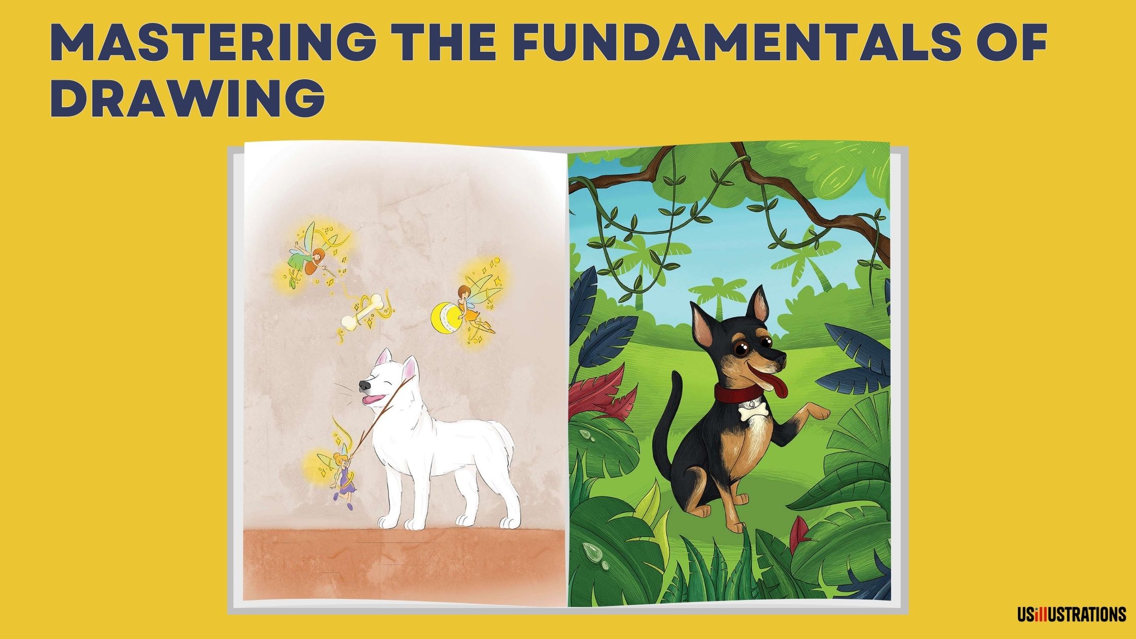
Complete character design before starting any page. Build character sheets with turnarounds (front, side, back, three-quarter) and 8–10 expression studies. This is the most important pre-production investment — every consistency problem in published children's books traces back to inadequate character planning.
Storyboard all 32 pages. Plan the visual narrative as a complete sequence before developing any individual spread. Pacing, composition variety, and page-turn strategy all depend on seeing the whole book at once.

Work at print resolution (300 DPI) from the start. Scaling up later produces blurry results. Set canvas to final print dimensions plus bleed (0.125" on each edge) before making any marks.
Use a limited, consistent color palette. 8–12 colors maximum for the master palette. Shift emphasis across the book to mirror emotional arc, but don't introduce new colors mid-book. Assign signature colors to main characters for visual tracking.
Design text areas into compositions. Plan where text will sit before finalizing any illustration. Create readable zones within the art — sky areas, quiet backgrounds, soft-colored regions. Never force text onto a completed illustration as an afterthought.
Vary composition deliberately. Alternate close-ups, medium shots, and wide shots. Use full-bleed for climactic moments, spot illustration for transitions, panels for rapid sequences. Monotonous composition destroys reader engagement regardless of individual illustration quality.
Reference the character sheet for every illustration. Check proportions against the reference at the end of every drawing session. Character drift is cumulative and invisible until you compare page 1 with page 30. Professional illustrators check obsessively; amateurs check occasionally.
Commit to one illustration style for the entire book. Mixing styles (cartoon on some pages, realistic on others) breaks visual coherence unless it's a deliberate storytelling choice. The style should match the story's tone and target age group.
Build visual identity beyond individual illustrations. The book should have a recognizable visual personality — a specific palette, a consistent quality of line, a characteristic approach to backgrounds. When someone sees a single illustration, they should be able to identify it as belonging to your book.
Study the market. Review the top 20 books in your Amazon subcategory. Note common visual approaches, identify gaps, and position your book to fit reader expectations while offering something distinctive.
Make the cover your strongest illustration. It sells the book at thumbnail size on Amazon and at arm's length on bookstore shelves. Feature the main character prominently, make the title readable at 1" display, and ensure genre and age group are immediately clear.
Design the full wrap — front, spine, back. Include synopsis, barcode area, and design continuity. The back cover is the second-most-viewed part of a physical book. See current cover design trends for market-informed approaches.
Match interior and cover style. A mismatch creates bait-and-switch disappointment that generates negative reviews. The cover should accurately represent the interior visual experience.
Deliver files in correct specifications. 300 DPI, CMYK color space, 0.125" bleed, fonts outlined, correct dimensions per printer template. Professional file delivery is a basic competency — not an optional extra.
Color-proof before printing. Review a physical proof or high-quality soft proof before authorizing the print run. CMYK printing cannot reproduce all screen colors — verify that the printed result matches your expectations.
Organize files logically. Name files consistently (spread_01.tif, spread_02.tif), include a ReadMe with specifications, and deliver both CMYK (print) and RGB (screen) versions. Clean file delivery marks you as a professional.
At US Illustrations, every best practice in this guide is built into the standard workflow. Authors receive structured review at every phase, consistent character design, market-informed style direction, and print-ready production files. Free trial sketch to evaluate the approach. Pricing from $120 per illustration.
We'll send your fully colored illustration within 24 hours!
%20(1).png)
Best practices in children's book illustration exist because they prevent expensive, time-consuming problems. Character design before page art prevents consistency issues. Storyboarding prevents pacing problems. Print-resolution workflow prevents quality disasters. Limited palettes prevent visual chaos. These aren't constraints on creativity — they're the foundation that makes creative excellence possible across a 32-page production.
Character design before page illustration. Every other best practice becomes easier when the character is properly designed, documented, and referenced throughout production. Skip character design, and consistency problems multiply across every page in the book.
8–12 colors for the master palette. This creates visual harmony across all pages while allowing enough variety for different moods and scenes. Individual spreads can emphasize different palette colors, but avoid introducing completely new colors mid-book. Assign signature colors to main characters.
300 DPI at final print dimensions — always. Set this before making any marks. Include 0.125" bleed on edges that extend to the page trim. Work in CMYK color space for print. These are non-negotiable production standards.
Three tools: a detailed character sheet (reference for every illustration), a master color palette (sample from it rather than eyeballing), and regular consistency checks (overlay the character sheet on finished illustrations to verify proportions match). Check at the end of every drawing session, not just at the end of the project.
Salisbury, M. (2004). Illustrating Children's Books. Barron's Educational Series.
Shulevitz, U. (1985). Writing with Pictures. Watson-Guptill Publications.
Graphic Artists Guild. (2024). Handbook: Pricing & Ethical Guidelines. 17th Edition.

