"Adorable" in children's book illustration isn't subjective — it's a set of specific design principles rooted in neoteny (baby-like features that trigger protective responses in humans). Round shapes, large eyes, small noses, big heads on small bodies — these features activate the same neural pathways as looking at an actual baby. Understanding why certain designs feel adorable lets you engineer that response deliberately rather than hoping for it accidentally. Here's how to create characters that children and adults both find irresistible.
In 1943, ethologist Konrad Lorenz identified the "baby schema" — a set of physical features that trigger caregiving instincts in humans. These features include: a large head relative to body size, large eyes positioned low on the face, a round face shape, small nose and mouth, soft body contours, and chubby proportions.
Children's book character design directly leverages this biology. The most beloved characters in picture books — from Winnie the Pooh to the Very Hungry Caterpillar to Mog the Cat — all exhibit multiple baby schema features, even when they're animals or non-human creatures.
This isn't manipulation — it's effective visual communication. Adorable characters feel safe, approachable, and emotionally accessible to young readers. They create an immediate "I like this character" response that draws children into the story before the first word is read.

The single most impactful design choice for adorability is head-to-body ratio. In a realistic adult human, the head is about 1/8 of the total body height. In adorable children's book characters, the head is typically 1/3 to 1/2 of the total body height.
For maximum adorability: use a 1:2 ratio (head is half the body height). This extreme proportion works for the youngest readers (0–3) and the most stylized illustration styles. A 1:3 ratio works for the 3–6 age range, maintaining adorability while allowing more realistic body language and movement.
The same principle applies to animal characters. A realistic cat has a small head relative to its body. An adorable picture book cat has an oversized head, shortened legs, and a rounded body. The proportional exaggeration is what transforms a realistic animal into a lovable character.
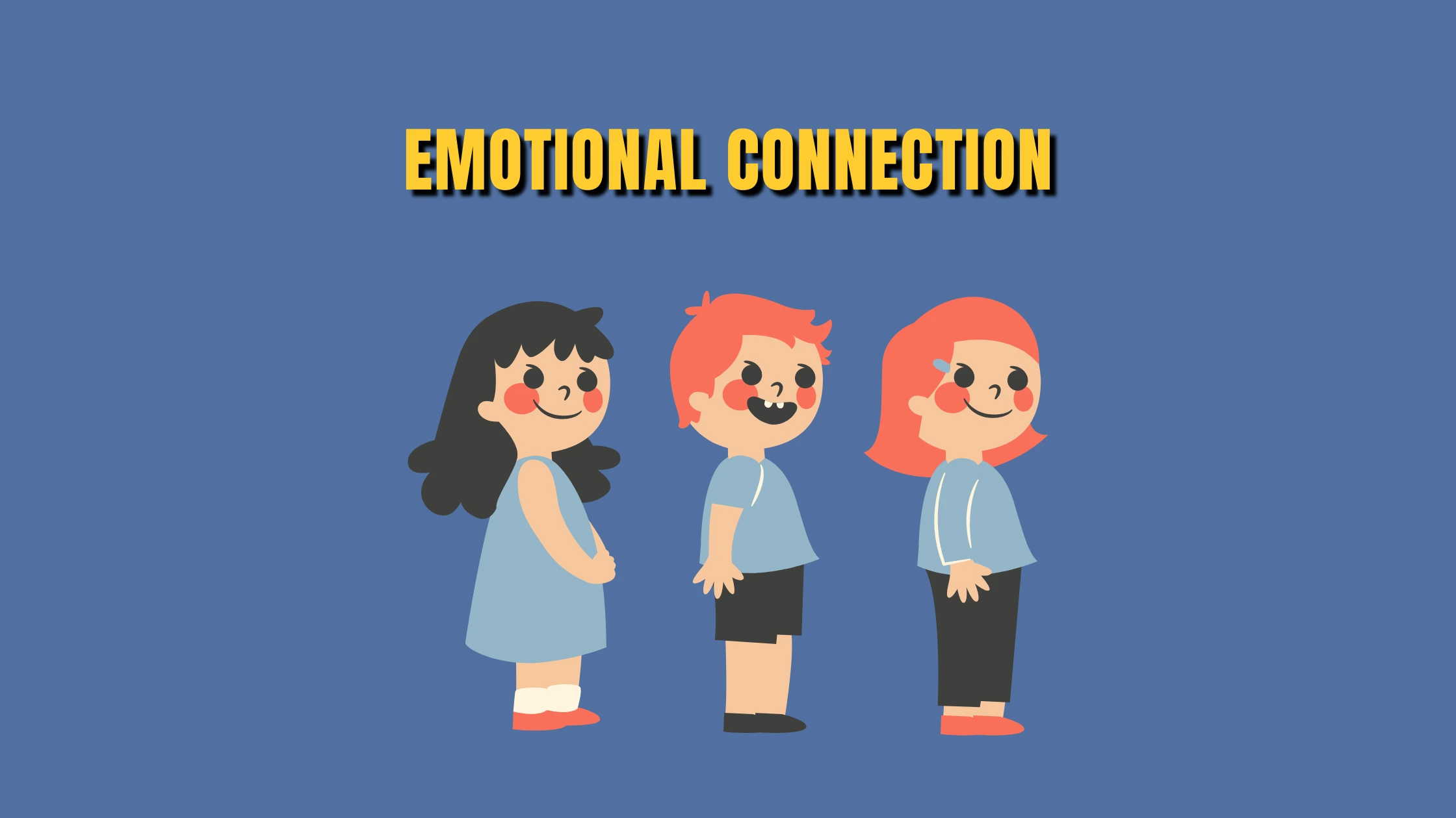
Eyes are where emotional connection happens. In adorable character design, eyes are typically 20–30% of the face's total area — far larger than realistic proportions. They should be positioned in the lower half of the face (leaving a large forehead area above), which enhances the baby schema effect.
Iris size matters. Large irises with small whites (or no visible whites) create a gentle, innocent look. Smaller irises with more visible whites create a more alert, energetic look. For maximum adorability, the iris should fill most of the eye.
Highlight placement. A single white highlight dot in the upper portion of each eye creates the illusion of moisture and life. Two highlights (one large, one small) create a more sparkly, animated feeling. The highlight position should be consistent across all illustrations in the book.
Expression range. Large eyes allow for exaggerated expressions — squished shut for laughing, wide and round for surprise, half-closed for sleepy contentment. Test your character's eye design by drawing it in 8–10 different emotional states. If any emotion doesn't read clearly, adjust the eye proportions.
Humans instinctively read shapes as emotional signals. Round shapes feel safe and friendly. Angular shapes feel energetic or dangerous. Soft curves feel gentle. Sharp edges feel threatening. This shape language is universal — it works across cultures and age groups.
For adorable characters: build the entire design from circles and soft curves. Head: circle. Body: oval or rounded rectangle. Arms and legs: tapered cylinders with rounded ends. Even angular elements (a hat brim, a book corner) should have softened edges in an adorable character design.
Contrast this with a villainous or mischievous character: angular body, pointed features, straight lines. The visual contrast between a round protagonist and an angular antagonist communicates their relationship before any plot unfolds.
Apply shape language to accessories and environments too. An adorable character should live in a world of soft shapes — rounded furniture, curvy paths, puffy clouds. The entire visual world reinforces the emotional tone.
Adorable characters tend toward warm, soft, and slightly desaturated colors rather than harsh, cold, or fully saturated ones.
Warm pastels — soft pinks, peach, light yellows, warm lavender — feel gentle and approachable. These work especially well for the youngest audiences (0–3).
Warm mid-tones — warm brown, dusty rose, soft orange, muted teal — feel cozy and inviting. These work well for the 3–6 picture book range.
Avoid pure black outlines on adorable characters. Warm dark brown, dark blue, or dark purple outlines feel softer than black. If you use black, make it a warm charcoal rather than pure #000000.
Assign your character a signature color that appears on every page — it helps young readers track the character and creates visual brand recognition for the book.
Before finalizing your character design, verify:
✓ Head-to-body ratio is 1:2 to 1:3 (not realistic proportions)
✓ Eyes are large, positioned in the lower half of the face
✓ Body is built primarily from round and soft shapes
✓ Colors are warm, soft, and slightly desaturated
✓ The character is recognizable from silhouette alone
✓ Expressions range convincingly across 8+ emotions
✓ The character looks consistent from multiple angles
At US Illustrations, character design is the first production phase for every project. The character design process includes exploration sketches, refinement rounds, and a comprehensive character sheet before any page illustrations begin. A free trial sketch lets you evaluate the adorability factor before committing. Pricing from $120 per illustration.
We'll send your fully colored illustration within 24 hours!
%20(1).png)
Adorable character design is applied psychology — leveraging baby schema features (large head, big eyes, round shapes, soft colors) to trigger innate nurturing responses. These principles are universal and learnable. Combine biological adorability with distinctive personality traits, test the design across a full range of expressions and angles, and document everything on a character sheet. The result is a character that children connect with instantly and remember long after the book is closed.
Yes — the same baby schema principles apply. Oversized head, large eyes, rounded body, soft shapes. A realistic horse isn't adorable. A horse with a big round head, huge sparkly eyes, short stubby legs, and a chubby body is adorable. The biological response to baby schema features works regardless of the character's species or nature.
Subtly, yes. 'Cute' can include small, delicate, and pretty designs. 'Adorable' specifically triggers the nurturing/protective response associated with baby schema — it's about vulnerability and innocence. A kitten wearing a tiny hat is cute. A kitten with oversized eyes looking up helplessly is adorable. For children's books targeting the youngest readers, aim for adorable.
Adorability comes from proportions and shapes. Interest comes from personality — a distinctive quirk, an unusual color combination, an unexpected accessory, or a signature pose. The best adorable characters combine baby schema features with something unexpected: an adorable bear who's also visibly brave, a cute rabbit with a mischievous glint in the eye.
Ages 0–4 respond most strongly to maximum baby schema features (extreme proportions, simple shapes). Ages 4–7 still respond to adorability but also want personality and dynamism. Ages 7+ start preferring more realistic or 'cool' character designs, though adorable designs still work in comedy contexts.
Professional character designers typically explore 15–30 quick thumbnail concepts, narrow to 3–5 promising candidates, then refine the top 1–2 into detailed designs. Rushing to a final design without adequate exploration almost always produces a weaker result. The exploration phase is where the best ideas emerge.
Lorenz, K. (1943). "Die angeborenen Formen möglicher Erfahrung." Zeitschrift für Tierpsychologie, 5(2), 235–409.
Bancroft, T. (2006). Creating Characters with Personality. Watson-Guptill Publications.
Silver, S. (2017). Character Design. Design Studio Press.

