A children's book cover has more parts than most people realize — and each part has specific design requirements, technical specifications, and functional purposes. Understanding cover anatomy helps authors communicate effectively with designers, prepare correct files for printers, and make informed decisions about what goes where. This guide breaks down every part of a children's book cover with practical specifications and design guidance.
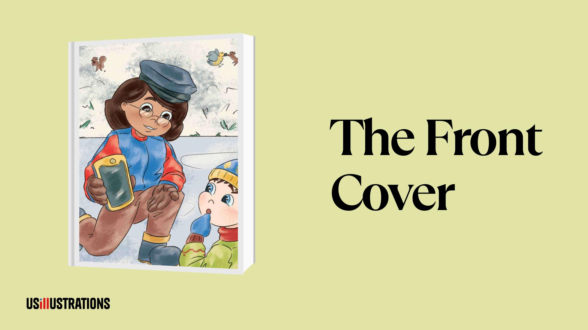
The front cover is the single most important visual element of your entire book. It's what appears as the Amazon thumbnail, what faces outward on bookstore shelves, and what parents and children see first.
Title. The largest text element. Must be readable at thumbnail size (~1 inch). Typically positioned in the top third or center of the cover. Custom hand-lettering or carefully selected display fonts — never default system fonts. The title should integrate with the illustration as part of the design, not sit on top of it as an afterthought.
Subtitle (optional). Smaller text below the title that clarifies the book's content. Common in non-fiction children's books, rare in picture books. Should complement the title without cluttering the cover.
Author name. Below the title, typically at the bottom of the cover. Smaller than the title but still readable. For debut authors, the name is functional. For established authors, the name can be a selling point sized accordingly.
Illustrator name. Often included on the front cover, sometimes matching the author name size (especially if the illustrator is well-known). Format: "Illustrated by [Name]" or just the name beneath the author's.
Cover illustration. The dominant visual element. Should feature the main character prominently — ideally making eye contact or engaged in compelling action. Must clearly communicate genre, age group, and tone. The illustration style should match your target audience. The illustration style must match the interior art. Professional cover illustration is the most important investment you can make.

In bookstores, the spine is often the only visible part of your book. It's the narrow edge between front and back covers.
Spine width depends on page count and paper stock. Your printer provides exact specifications. A 32-page picture book on standard 100lb text stock has a spine approximately 0.15"–0.25" wide. Board books have much wider spines (0.5"–1").
Spine text: Title and author name, running vertically. Text should read top-to-bottom when the book is lying face-up (industry standard in the US). Font size must fit the spine width — typically 6–10pt depending on available space.
Design considerations: Use the same background color or design as the front cover for visual continuity. If the spine is too narrow for text (thin picture books), some publishers omit spine text entirely. A small logo or icon can replace text on very narrow spines.
The back cover is the second-most-viewed part of a physical book. In bookstores, a customer picks up the book (front cover), then immediately flips to the back.
Synopsis/blurb. 2–4 sentences that hook the reader without spoiling the story. For writing techniques, see our cover design tips guide. For picture books, this is often a single compelling sentence or a short rhyming tagline. For chapter books and middle grade, it's a mini plot summary ending on a question or cliffhanger. Position: upper half of the back cover.
Barcode and ISBN. Required for bookstore distribution and online retail. Standard position: lower right corner. The barcode encodes the ISBN and price. Minimum size: approximately 2"×1.2". Purchase ISBNs from Bowker (US) — $125 for a single ISBN, $295 for 10.
Author/illustrator bio. Brief (2–3 sentences) biographical note, often with a small headshot. Position: lower left or center of the back cover. Keep it warm and relevant to children's books.
Back cover illustration. A small illustration, pattern, or design element that ties visually to the front cover. This creates a sense that the cover is a complete design wrap, not just a front with an afterthought back.
Review quotes/endorsements. If you have them, position prominently on the back cover. Author endorsements, review excerpts, or award mentions significantly influence purchase decisions.

Hardcover books have endpapers — the pages glued to the inside of the front and back covers. These are often overlooked but offer a design opportunity:
Solid color endpapers (simplest, cheapest). Choose a color from the book's palette for visual cohesion.
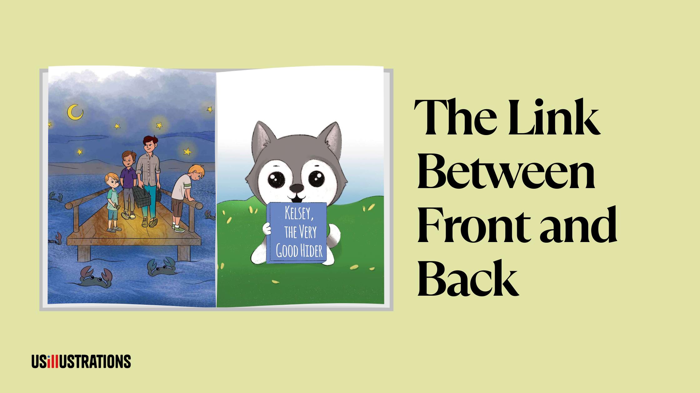
Patterned endpapers. A repeating pattern using elements from the book's illustrations — character silhouettes, props, environmental motifs. This adds a premium feel and delights readers who notice the detail.
Narrative endpapers. Illustrations that extend the story — a map, a "before" and "after" scene, or a visual that provides context not found in the main book. This is the most sophisticated approach and is common in award-winning picture books. For more on how interior design choices affect the reader experience, see our layout design guide.

A dust jacket is a separate paper wrapper around the hardcover case. Not all hardcovers have them — many children's books are "case laminate" (printed directly on the hard cover) for durability.
Front and back flaps. Dust jackets have two flaps (front and back) that fold inside the cover. The front flap typically carries an extended synopsis. The back flap carries the author/illustrator bio and photo. These are premium real estate for marketing copy.
Under the jacket. Some designers create a simpler, different design on the actual hardcover beneath the dust jacket — a hidden surprise for readers who remove it. This is an advanced design touch that delights children and adds collectible value.
Your printer or print-on-demand service provides a cover template with exact dimensions. Key specifications:
Bleed: 0.125" on all outer edges. Artwork must extend beyond the trim line to prevent white edges after cutting.
Safe zone: Keep all text and critical elements at least 0.25" inside the trim line.
Resolution: 300 DPI minimum at final print size.
Color space: CMYK for print. Convert from RGB early in the design process.
File format: PDF/X-1a with fonts embedded or outlined.
At US Illustrations, cover design is included in the illustration package. The cover illustration matches the interior art style, and files are delivered print-ready to your specifications. A free trial sketch evaluates the style direction. Pricing from $120 per illustration covers the complete workflow.
We'll send your fully colored illustration within 24 hours!
%20(1).png)
A children's book cover is a multi-part design system — front cover, spine, back cover, endpapers, and optionally a dust jacket — each with specific functional requirements and design opportunities. Understanding cover anatomy helps you communicate with designers, prepare correct files, and make informed decisions about one of the most important elements of your book. Every part should be designed with intention — the cover is where the sale happens.
A complete book cover has: front cover (title, author name, main illustration), spine (title, author name, vertical), back cover (synopsis, barcode/ISBN, author bio, optional illustration), and for hardcovers: endpapers and optionally a dust jacket with front and back flaps.
Spine width depends on page count and paper stock — your printer provides exact specifications in their cover template. A typical 32-page picture book on 100lb text has a spine of approximately 0.15"–0.25". Board books have wider spines (0.5"–1"). Never guess the spine width — always use the printer's template.
Yes, if you want bookstore distribution or library acquisitions. Purchase from Bowker (US): $125 for one ISBN or $295 for 10. Amazon KDP provides free ISBNs, but they can only be used on Amazon. A Bowker ISBN works everywhere and establishes you as the publisher of record.
The back cover matters significantly. In physical bookstores, it's the second thing a customer sees. Online, back cover images appear in product listings. A well-designed back cover with a compelling synopsis, professional layout, and visual continuity from the front cover increases purchase conversion.
PDF/X-1a format, 300 DPI, CMYK color space, with 0.125" bleed on outer edges and fonts embedded or outlined. The front, spine, and back should be a single continuous file (called a 'cover wrap'). Your printer provides a template with exact dimensions including spine width.
Haslam, A. (2006). Book Design. Laurence King Publishing.
Lupton, E. (2010). Thinking with Type. Princeton Architectural Press.
Kidd, C. (2015). Judge This. TED Books.

