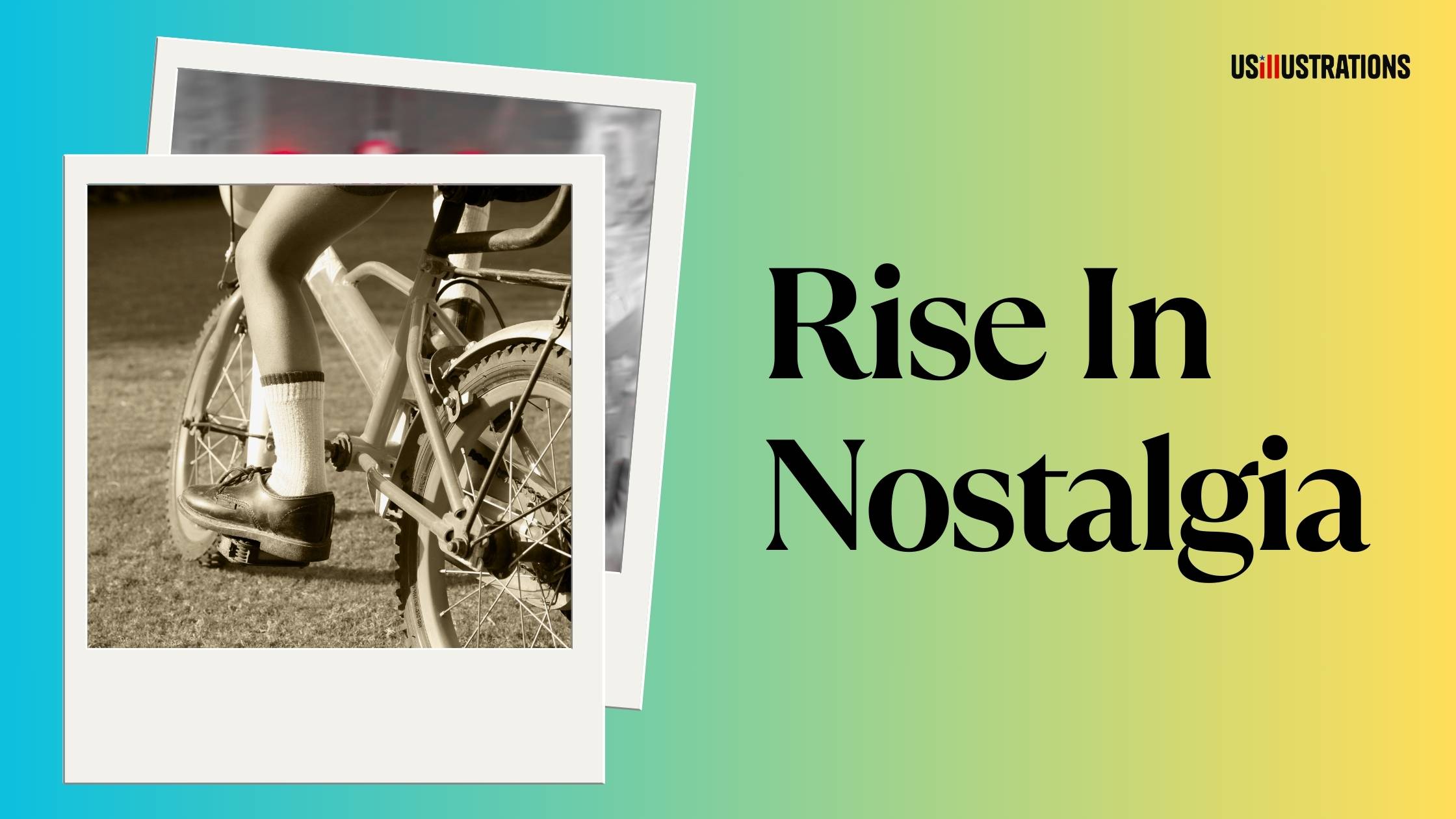
Children's book cover design evolves constantly. What sold books five years ago looks dated on today's bookstore shelves and Amazon thumbnails. Staying current with cover trends isn't about following fads — it's about understanding what visual language today's parents and readers respond to, so your book competes effectively. Here's what's working in children's book cover design right now, why these trends emerged, and how to apply them to your project.
The most noticeable shift in recent years: titles that dominate the cover. Hand-lettered or custom display type takes up 40–60% of the cover space, often intertwined with the illustration. The lettering itself becomes part of the art — characters climbing on letters, text wrapping around elements, or typography that reflects the story's mood.
Why it works: Amazon thumbnails are tiny. A cover where the title is small and elegant might look refined at full size, but it's invisible at thumbnail scale. Bold typography solves the discoverability problem — the title is readable even at the smallest preview size. For self-published authors, this is critical since most sales discovery happens online.
How to apply it: commission custom hand-lettering that matches your illustration style, rather than using a standard font. The integration of text and art should feel seamless. If the text looks "placed on top" of the illustration, the cover loses the cohesive quality that makes bold typography effective.

Covers now routinely feature characters from a wide range of ethnicities, body types, abilities, and family structures. This isn't just a social trend — it's a market reality. Diverse books outsell their homogeneous counterparts in most categories, and parents actively seek books that reflect their children's reality or expand their world.
For cover design, this means: characters should be depicted with cultural specificity and accuracy (not generic skin-tone swaps), authentic clothing and hairstyles matter, and the character's identity should feel celebrated rather than tokenized. Illustrators who can authentically represent diverse characters have a significant competitive advantage.
See our illustration styles guide for how different artistic approaches handle representation across cultural contexts.
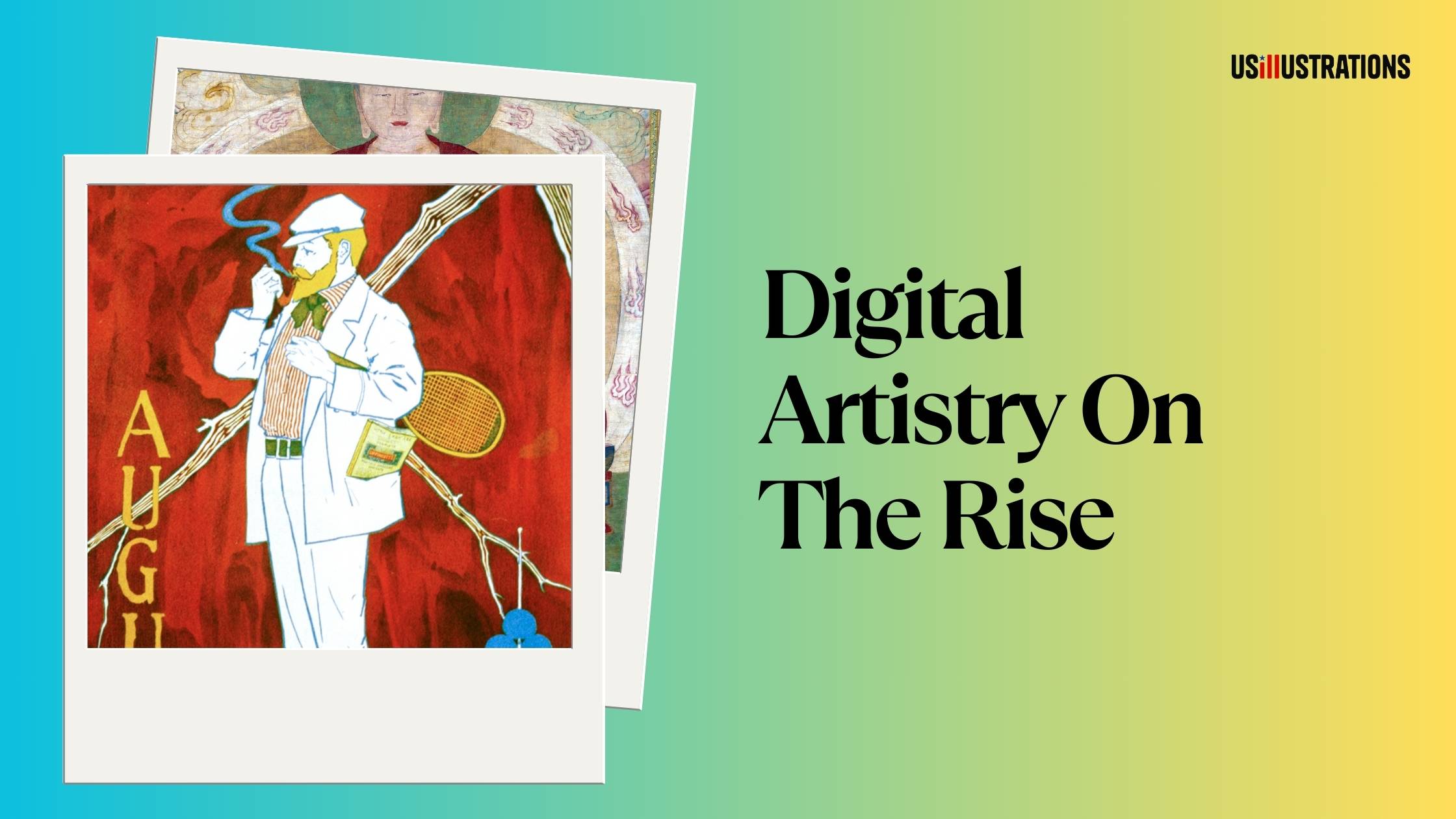
After a period of clean, polished digital illustration dominating covers, there's a strong swing back toward textured, organic-feeling artwork. Visible brush strokes, paper texture, watercolor bleeds, gouache grain, and collage elements signal "handmade" and "artisanal" — qualities that parents associate with quality and care.
This doesn't mean the work is actually traditional media — many illustrators achieve these textures digitally using specialized brushes and texture overlays in Procreate and Photoshop. The hybrid approach (traditional base + digital finishing) is especially popular for covers because it combines organic texture with production flexibility.
Why it works: in a marketplace flooded with AI-generated and stock-looking digital art, textured handmade aesthetics immediately signal "this was made by a real artist." It's a trust signal that differentiates professional work from mass-produced content.

Covers increasingly use dramatic lighting, atmospheric effects, and cinematic composition — borrowing from animated film and concept art traditions. Think: a character silhouetted against a glowing doorway, dramatic backlighting creating rim light on hair, or atmospheric fog creating depth layers.
This trend is strongest in middle grade and upper picture book covers (ages 5–10) where slightly more sophisticated visual storytelling resonates. Board book covers still favor flat, bright, simple compositions.
For self-published authors, cinematic covers stand out in Amazon search results because they create mood and atmosphere that flat, simple designs can't match. A cover that looks like a frame from a Pixar film signals production quality that attracts clicks.
On the opposite end from cinematic complexity, some of the most successful recent children's book covers use extreme simplicity: a single character or object against a solid or near-solid background. One focal element, strong color contrast, zero clutter.
Why minimalist works: it's instantly readable at any size, it creates a strong visual identity (easy to remember), and it signals confidence — only a well-designed character can carry a cover alone without environmental support.
This approach works best when the character design is strong enough to be the sole visual hook. A generic character on a white background is boring. A distinctive, personality-filled character on a white background is iconic. The character does all the heavy lifting, which means the character design investment matters enormously.
Trends inform direction, but blindly following them produces work that ages quickly. The smart approach:
Research your specific category. Look at the top 20 bestselling covers in your exact Amazon subcategory. Note which trends they reflect and which they don't. Your cover should fit within reader expectations while offering something distinctive.
Choose one trend to lean into, not all five. A cover that tries to be bold-typography, cinematic, textured, minimalist, AND diverse simultaneously is a mess. Pick the approach that best serves your specific story and audience.
Prioritize timeless fundamentals. Strong character design, readable composition, and genre-appropriate color will outlast any trend. Trends add contemporary appeal on top of these foundations.
At US Illustrations, cover design is informed by current market trends and tailored to your book's specific category and audience. The free trial sketch lets you evaluate the direction before committing. Flat-fee pricing from $120 per illustration keeps the investment predictable.
We'll send your fully colored illustration within 24 hours!
%20(1).png)
For a broader perspective, see our complete cover design guide.
Cover trends reflect shifting reader expectations, platform requirements (especially Amazon thumbnail visibility), and cultural values. The current landscape favors bold typography, diverse representation, textured aesthetics, cinematic composition, and confident minimalism. Apply trends strategically — choose one or two that serve your specific story and audience, build them on top of timeless design fundamentals, and invest in professional execution. Your cover is the first impression that determines whether anyone reads the words inside.
Major trends shift every 3–5 years, with gradual evolution in between. Typography and color trends change faster (1–2 years). Illustration style trends change more slowly. The safest approach: build on timeless design fundamentals (strong character, clear composition, readable typography) and apply one or two current trends as accent.
Only if your current cover is measurably underperforming (low click-through rate on Amazon, poor conversion despite good reviews). A cover refresh can boost sales, but only if the new design is genuinely stronger. Changing a working cover to chase trends is unnecessary and risky.
Slightly. Traditional publishers tend to be more conservative, following trends 6–12 months after they emerge. Self-published covers can move faster and take more risks. But the fundamentals are identical: clear title, strong focal character, age-appropriate style, and readable at thumbnail size.
It's the single most important factor for initial clicks. On Amazon, readers see the cover thumbnail before anything else. Studies consistently show that cover quality is the #1 factor in click-through rates for book listings. A great book with a bad cover will underperform a good book with a great cover.
AI can generate visually appealing single images, but it struggles with the specific requirements of cover design: integrating typography with illustration, matching interior art style, maintaining brand consistency across a series, and meeting print specifications. Professional cover design requires human creative judgment and technical expertise that current AI tools can't reliably provide.
Kidd, C. (2015). Judge This. TED Books.
Lupton, E. (2010). Thinking with Type. Princeton Architectural Press.
Cooperative Children's Book Center. (2024). Observations on Publishing in 2023. University of Wisconsin-Madison.

