Children's book illustration has principles that separate professional work from amateur attempts. These aren't arbitrary artistic preferences — they're practical rules that come from decades of publishing experience and child development research. Ignore them, and your book looks like a hobby project. Follow them, and you produce illustrations that publishers take seriously and children actually engage with. Here are the five rules that matter most, with specific guidance on how to apply each one.
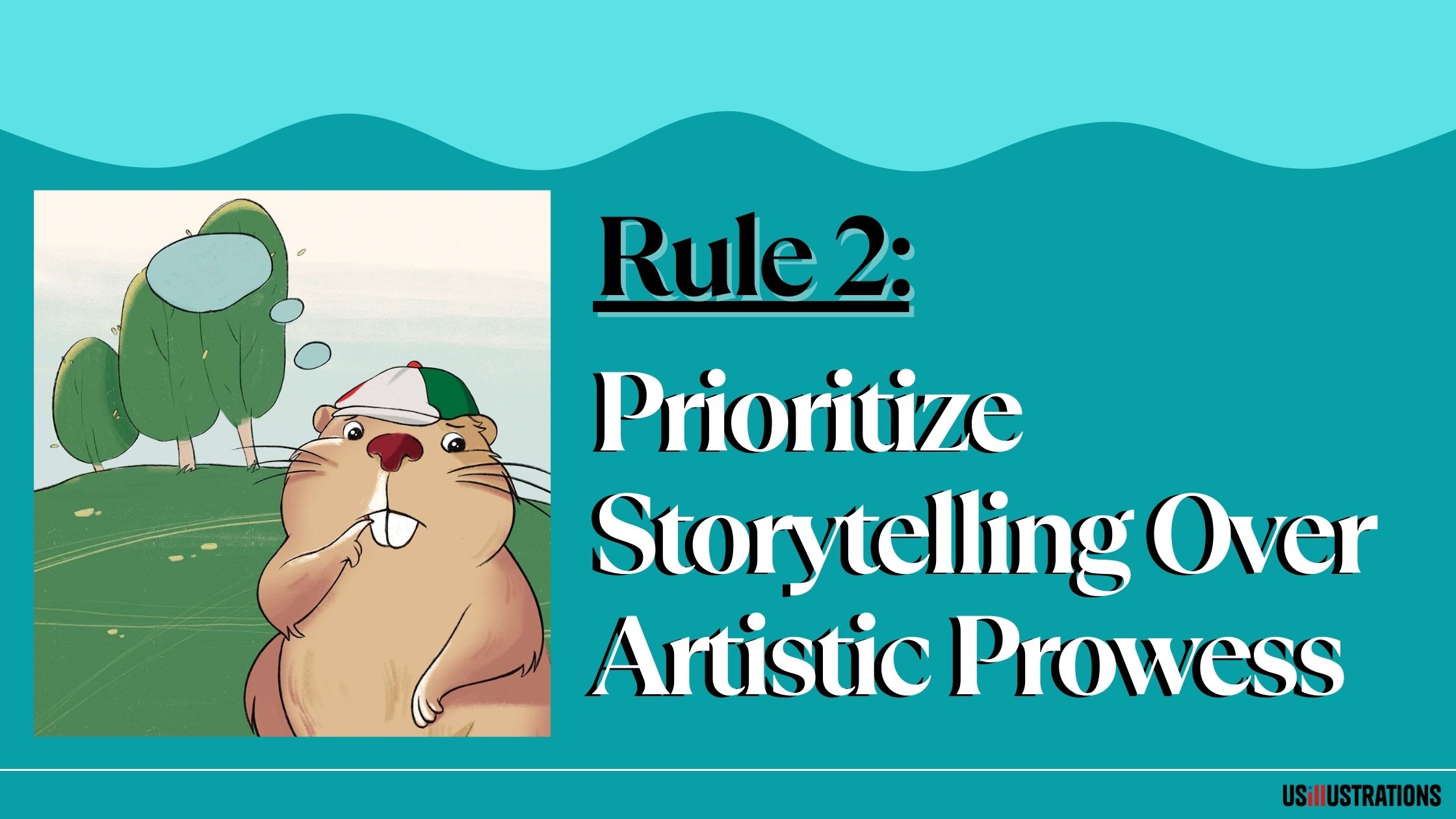
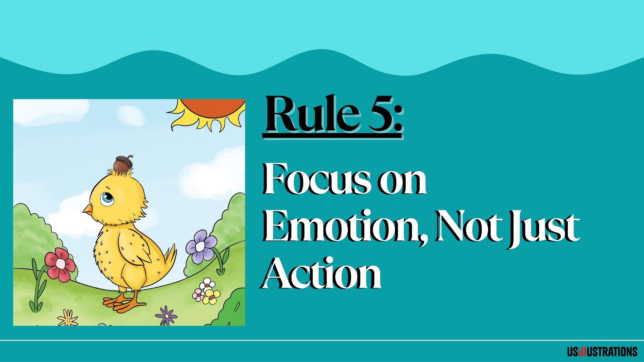
A children's book illustration is not a portrait. It's not a landscape. It's a narrative moment — a frozen frame from a movie that implies what happened before and what happens next. Every illustration should answer: who is doing what, where, and why does it matter?
This means your character should be doing something, not just existing. Standing and smiling is a portrait. Reaching for a cookie jar while looking nervously over their shoulder is a story. The difference between these two approaches is the difference between decoration and illustration.
Professional illustrators use three techniques to build narrative into a single image:
Action and gesture. Characters should be caught mid-motion. A character running looks more dynamic than a character standing. Even in quiet moments, body language communicates internal state — slumped shoulders for sadness, fidgeting hands for nervousness, wide-open arms for joy.
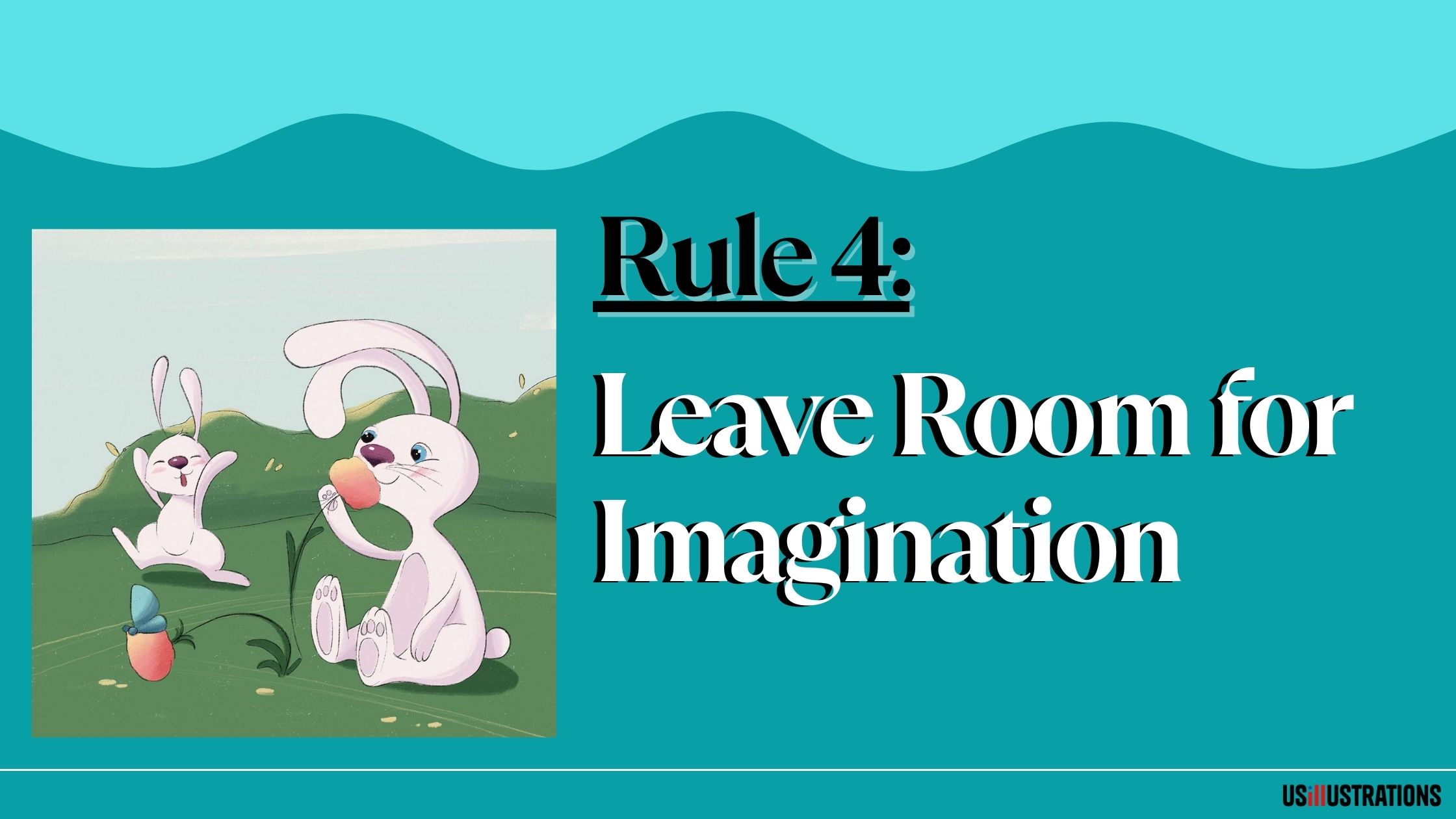
Environmental storytelling. The background tells part of the story. A messy room, a ticking clock, a half-eaten meal — these details create context without requiring words. Children notice background details on re-reads, which is one reason they request the same book repeatedly.
Implied continuation. The best illustrations make you want to turn the page. A character looking at something outside the frame. A door slightly open. Movement directed toward the page edge. These techniques create curiosity that drives the reading experience forward.

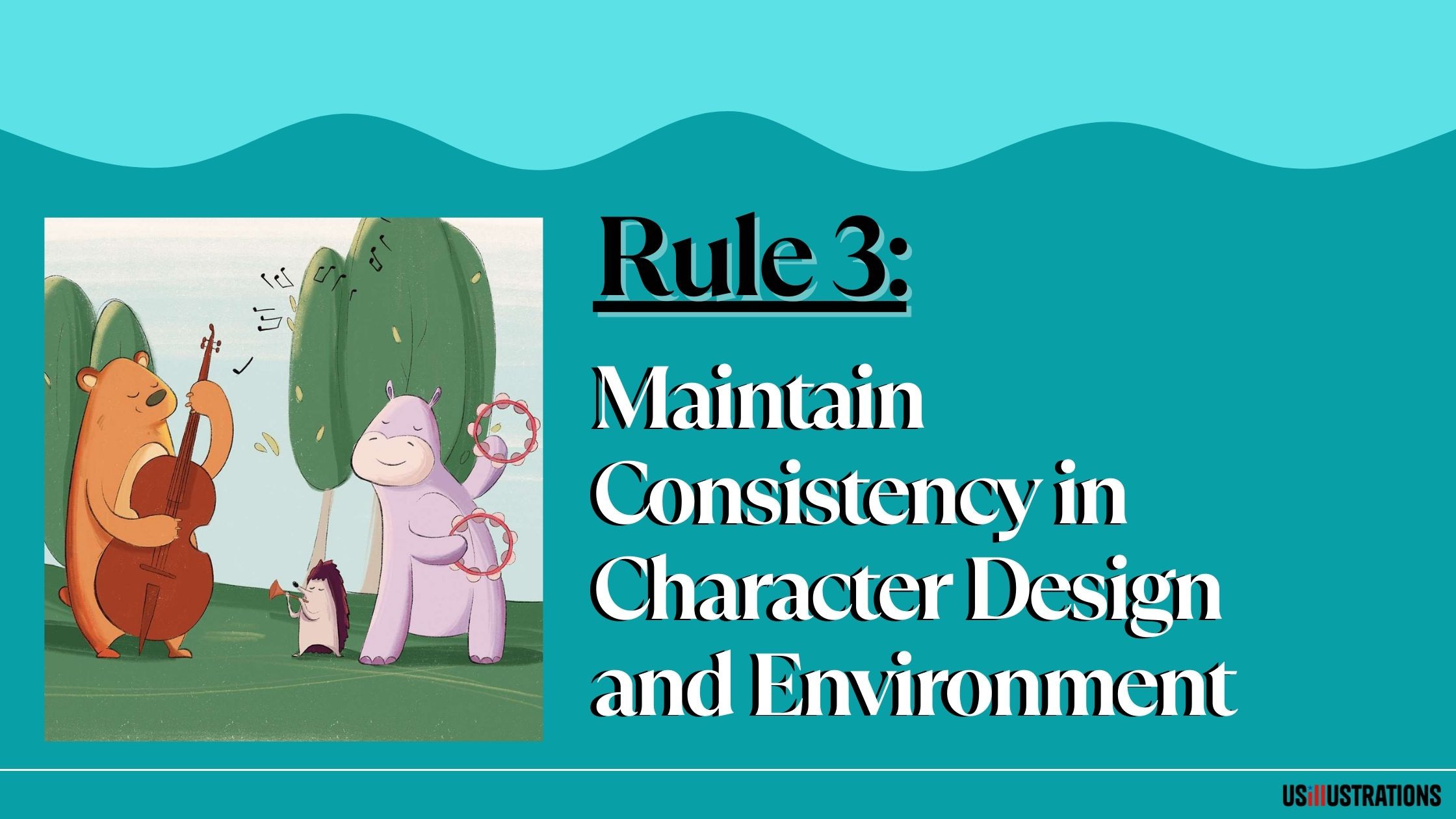
Your main character appears on nearly every page. If their proportions, colors, or features shift from spread to spread, the illusion breaks. Young readers track characters visually — they're looking at the pictures more than the words — and inconsistency creates confusion.
Professional character designers solve this with a character sheet: a reference document showing the character from multiple angles (front, side, three-quarter, back) with detailed notes on proportions, colors, and distinguishing features. Every illustration is drawn referencing this sheet.
The character sheet should also include an expression range: 6–8 drawings of the character's face showing different emotions (happy, sad, angry, surprised, scared, confused, excited, thoughtful). This ensures expressions are consistent across the book and that the character's face can handle whatever the story requires.
A good test: cover the background of two different page illustrations. Can you tell it's the same character? If there's any doubt, the consistency needs work.
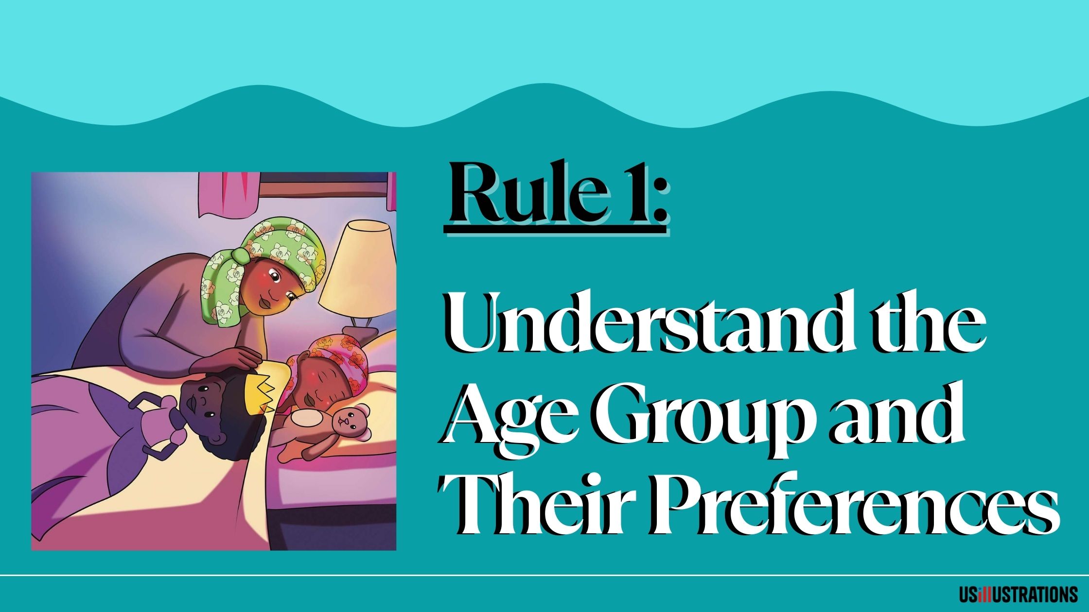
A 2-year-old and an 8-year-old have fundamentally different visual processing abilities, attention spans, and aesthetic preferences. Illustrations that work for one age group often fail for another. Match your visual complexity to your target reader.
Board books (0–3 years): Bold, simple shapes. High contrast. Maximum 2–3 focal elements per page. Thick outlines. Bright, saturated primary colors. Minimal background detail. Characters should be immediately recognizable from shape alone. Think: a red circle with two dots for eyes and a curve for a mouth reads as "happy face" for a toddler.
Picture books (3–6 years): The sweet spot for character design. More detail, personality, and environmental complexity. Expressive faces with clear emotions. Rich backgrounds that reward exploration. This age group engages deeply with illustrations and often notices details adults miss.
Early readers (6–9 years): More realistic proportions. Greater environmental detail and accuracy. Characters can be more nuanced in expression and pose. Spot illustrations (smaller images surrounded by text) become more common as the text-to-image ratio shifts toward text.
Choosing the right illustration style is directly connected to your age group. A detailed watercolor style that works beautifully for a 5-year-old picture book will overwhelm a board book reader and bore a 9-year-old chapter book reader.
Composition — where elements are placed on the page — controls what the reader looks at first, second, and third. In a children's book, this isn't just aesthetics. It's navigation. You're physically directing a child's attention through the story.
Focal point hierarchy. Every spread needs one primary focal point (usually the main character's face or the key action). Supporting elements should lead the eye toward this focal point, not compete with it. If everything demands equal attention, nothing gets attention.
Reading direction. In English-language books, readers scan left to right, top to bottom. Place the beginning of the scene's action on the left and the conclusion (or page-turn prompt) on the right. Characters should generally face right (toward the page turn) to maintain reading momentum.
Scale and contrast. Important elements should be larger and higher-contrast than supporting elements. A character in danger should be small against a large, threatening environment. A character triumphant should dominate the spread. Scale communicates power dynamics and emotional weight.
White space. Empty space isn't wasted space — it's a compositional tool. White space around a character creates isolation or focus. A page packed edge-to-edge with detail creates energy or chaos. Use both deliberately. The layout design phase is where these decisions get planned across the full book.
Color in children's books isn't about what looks pretty — it's about what communicates the right emotion, directs attention, and maintains visual identity across 32 pages.
Emotional color mapping. Assign color temperatures to story beats. Warm colors (reds, oranges, yellows) for happy, energetic, or cozy scenes. Cool colors (blues, purples, grays) for sad, scary, or mysterious scenes. Shift the palette across the book to create an emotional arc that mirrors the narrative.
Character color identity. Give your main character a signature color that appears in every illustration — a red jacket, blue fur, a yellow hat. This color becomes an anchor that helps young readers find and track the character instantly on every page, even in complex scenes.
Attention through contrast. The highest-contrast element on the page gets looked at first. Make your main character the highest-contrast element by placing them against a complementary background. A warm-colored character pops against a cool background. A light character pops against a dark background.
Print-safe colors. Digital screens display RGB colors that can't always be reproduced in CMYK printing. Neon greens, electric blues, and hot pinks often look dull or muddy when printed. Test your palette in CMYK early to avoid disappointment. This is a technical detail your illustrator or illustration studio should handle, but it's worth understanding.
These five rules apply whether you're illustrating the book yourself or hiring a professional. If you're an author evaluating an illustrator's work, use these rules as your checklist: Does the illustration tell a story? Is the character consistent? Is the style appropriate for the age group? Does the composition guide my eye? Does the color serve the narrative?
At US Illustrations, these principles are built into every project. The process starts with a free trial sketch so you can evaluate the approach before committing, followed by character design, storyboarding, and structured review at every phase. Flat-fee pricing from $120 per illustration covers the complete professional workflow.
We'll send your fully colored illustration within 24 hours!
%20(1).png)
These five rules — narrative purpose, character consistency, age-appropriate design, deliberate composition, and story-serving color — form the foundation of professional children's book illustration. They're not optional refinements. They're the baseline that separates publishable work from amateur attempts. Master them, and everything else you learn about illustration has a solid structure to build on.
Character consistency. If your character doesn't look the same on every page, nothing else matters — the visual contract with the reader is broken. Build a detailed character sheet before starting any page illustrations, and reference it for every single drawing.
Test with actual children in your target age range. Watch their eyes — do they find the character quickly? Do they point to details? Do they engage with the page or flip past it? Also compare your visual complexity to published books successfully selling in your age category.
Yes, once you understand them. Rules can be broken for intentional effect — an inconsistent character to show transformation, chaotic composition to convey confusion, jarring color to signal danger. The key word is 'intentional.' Breaking rules by accident looks unprofessional. Breaking them on purpose looks sophisticated.
Yes. These are storytelling and design principles, not medium-specific techniques. Whether you work in watercolor, digital, collage, or mixed media, the rules of narrative illustration, consistency, age-appropriateness, composition, and purposeful color all apply.
Typically 2–3 rounds. Round 1: explore multiple concepts (10–20 thumbnails). Round 2: refine the top 3 candidates with more detail. Round 3: finalize the chosen design with a complete character sheet. Rushing this phase almost always leads to problems during full illustration.
Salisbury, M. (2004). Illustrating Children's Books. Barron's Educational Series.
Shulevitz, U. (1985). Writing with Pictures. Watson-Guptill Publications.
Nodelman, P. (1988). Words About Pictures. University of Georgia Press.

